34 Vintage Fonts on Canva (And Why Typography Alone Won’t Build Your Brand)

Vintage fonts have a way of making everything feel more considered. They carry weight, character, and a sense of craft that modern typefaces often leave behind. If you’re building a brand that leans into elegance, nostalgia, or artistry, the right typography can do a lot of the heavy lifting before a single word is even read.
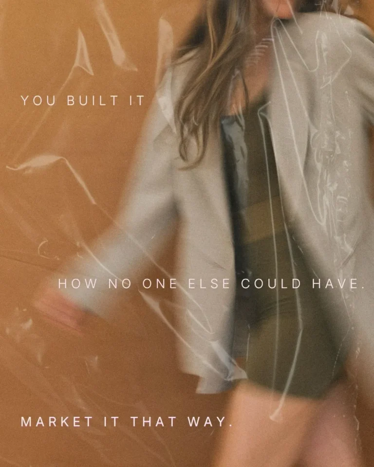
But here’s something worth sitting with before we get into the list: typography is one piece of a much larger puzzle. If you’ve ever spent hours choosing beautiful fonts and still felt like your brand wasn’t quite landing — like it looked good in one place and slightly off in another — this post is going to be honest with you about why that happens, and what to do about it.
First, the fonts. Then, the conversation.
Why Vintage Fonts Work So Well for Branding
Vintage fonts are more than decoration. They communicate meaning before a single word is read. They add instant personality — a serif with soft curves carries warmth, while a bold condensed type feels editorial or sophisticated. They guide tone, making a brand feel established, trustworthy, artistic, romantic, or refined depending on how they’re used. They support storytelling, and when your typography aligns with your values and narrative, your brand feels cohesive across every touchpoint. They also pair beautifully with modern minimalism — a little texture or character against a clean layout creates visual balance and depth.
If you choose your type intentionally, it becomes one of the strongest tools in your branding toolkit.
34 Free Vintage Fonts to Explore on Canva
We’re sharing out favourites, and perfect font pairings because we feel like we shouldn’t charge you for something that is already free – and Canva has an amazing selection of fonts available in both the free or pro version. You can search any of these names directly inside Canva. These work well for logos, headings, packaging, social media, and other brand assets.
Vintage fonts are more than decoration. They communicate meaning before a single word is read. Here’s why designers love them for brand identity work:
They add instant personality.
A serif with soft curves carries warmth. A bold, condensed type can feel editorial or sophisticated. A hand-drawn script feels artisanal.
They guide the tone.
Vintage fonts can make a brand feel established, trustworthy, artistic, romantic, or refined.
They support storytelling.
When your typography aligns with your values and narrative, your brand feels cohesive across every touchpoint.
They pair beautifully with modern minimalism.
A little texture or character against clean layouts creates visual balance and depth.
If you choose your type intentionally, it becomes one of the strongest tools in your branding toolkit.
The Best Vintage Fonts on Canva
Here are some standout options to explore in your designs. These work well for logos, headings, packaging, social media, and other brand assets. You can search any of these names directly inside Canva.
Pairing No. 01
Cormorant Garamond
paired with Josefin Sans
A brand that feels like home.
Refined and romantic. This pairing balances old-world elegance with geometric clarity — beautiful for wellness, beauty, and creative studios.
Pairing No. 02
Playfair Display
paired with Assistant
Elegant by nature.
A timeless editorial pairing. Playfair’s heritage warmth reads beautifully against Assistant’s quiet legibility. Works across almost every niche.
Pairing No. 03
Lora
paired with Raleway
Quiet confidence.
Soft, considered, and warm. A pairing for brands that lead with intention rather than volume. Especially strong for holistic and wellness brands.
Pairing No. 04
Marcellus
paired with Josefin Sans
Architectural. Assured.
Structure meets lightness. Marcellus carries real presence without heaviness — ideal for interior design, decor, and heritage-led brands.
Pairing No. 05
Italiana
paired with Raleway
Alta moda, every day.
Long, elegant letterforms that feel like Italian fashion paired with Raleway’s geometric body. Unmistakably refined and quietly confident.
Pairing No. 06
Cinzel
paired with Josefin Sans
Presence before a word is read.
Inspired by classical stone carving. Cinzel commands attention while Josefin Sans keeps it grounded. A pairing with real authority.
Pairing No. 07
Parisienne
paired with Libre Baskerville
Softly, beautifully yours.
Flowing script meets warm serif. A charming combination for artisan, floral, and handmade brands that want personality without noise.
Pairing No. 08
Sacramento
paired with Lora
Warmth in every detail.
A handwritten script with real grace paired with Lora’s readable warmth. Beautiful for wellness, beauty, and feminine-led creative brands.
Pairing No. 09
Libre Baskerville
paired with Raleway
Trusted from the first glance.
Heritage serif meets geometric sans. A pairing that communicates credibility and warmth in equal measure. Dependable across every use.
Pairing No. 10
Cardo
paired with Assistant
Quietly distinguished.
Understated and genuinely elegant. Cardo paired with Assistant is for brands that let their work speak first and their typography follow gently.
Pairing No. 11
IM Fell English
paired with Assistant
Old world. New story.
The feel of a manuscript brought into the present. Full of character and warmth. Ideal for artisan, literary, and heritage-inspired brands.
Pairing No. 12
Philosopher
paired with Josefin Sans
Grounded. Considered. True.
A pairing with depth and steadiness. Philosopher carries quiet wisdom that works beautifully for holistic health, mindfulness, and retreat brands.
Pairing No. 13
Rufina
paired with Raleway
Subtle. Sophisticated. Lasting.
One of the more understated vintage choices available. Refined without trying too hard — and all the more elegant for it.
Pairing No. 14
Fanwood Text
paired with Josefin Sans
Delicate. Literary. Refined.
A quiet pairing with real personality. For brands that value thoughtfulness over noise — and want their typography to feel considered, not curated.
Pairing No. 15
Oranienbaum
paired with Assistant
Aged beautifully. Like your brand will.
Elegant and slightly weathered, with italic variants that genuinely shine. A distinctive choice for heritage, decor, and boutique brands.
Pairing No. 16
Crimson Text
paired with Raleway
Story-led. Always.
Warm and narrative-driven. For brands that believe in the power of a well-told story — photographers, coaches, and creative entrepreneurs especially.
Pairing No. 17
Neuton
paired with Assistant
Warm. Versatile. Yours.
A refined serif with personality that works across a wide range of brand styles. One of the most adaptable pairings in this list.
How to Use Vintage Fonts Thoughtfully in Your Brand
Pick one lead font with character.
This becomes your hero typeface for logos and bold headings.
Balance it with simple supporting fonts.
Pair your vintage font with a clean serif or sans serif so your brand stays readable and modern.
Pay attention to spacing.
Vintage fonts often shine with extra breathing room, especially in logos and display headings.
Keep colour palettes soft and intentional.
Muted tones, neutrals, and minimal accents often allow vintage typography to stand out without feeling busy.
Stay consistent across all brand elements.
Typography is one of the easiest ways to build recognition. Once you choose your fonts, use them everywhere.
But Here’s What Fonts Can’t Do For You
This is the part most font guides leave out.
A beautiful typeface, chosen with care, can absolutely elevate a design. But it cannot build a brand on its own. And if you’ve been adjusting your Canva brand for months — tweaking the fonts, shifting the colours, trying to get it to feel more cohesive — the issue usually isn’t the font.
The issue is the absence of a visual system.
A brand is not a font selection or a colour palette. It’s the experience someone has every time they encounter your business — online, in a proposal, in a welcome email, in a conversation. When that experience feels fragmented or slightly off, potential clients feel it even if they can’t name it. And in the wellness, beauty, interior design, and creative industries, how your brand looks and feels is often the quiet deciding factor in whether someone reaches out.
Here’s what we see again and again when small business owners come to The Good Canvas after building their own brand in Canva:
The colours are close, but not codified. There’s no hex code document, no consistent application across platforms. The typography is layered rather than considered — three fonts that each felt right in isolation don’t necessarily speak the same visual language together. The logo works in one size but not all sizes. What looks beautiful on a mood board becomes muddy as a favicon or illegible on a business card. And the brand can’t scale. As the business grows, the visual identity can’t grow with it, because it was built for the moment rather than the long term.
None of this is a reflection of your taste or your creativity. It’s simply what happens when branding is approached as a design task rather than a strategic one.
The Shift That Changes Everything
The most transformative thing a small business owner can do for their online presence is to stop thinking of their brand as something they maintain and start thinking of it as something they invest in once, intentionally.
A professionally designed brand identity — built around your actual business, your clients, your values, and your visual language — creates coherence that Canva templates cannot replicate. Every touchpoint speaks from the same visual place. That coherence builds trust. And trust is what turns a visitor into an inquiry.
Keep your colour palettes soft and intentional. Muted tones, neutrals, and minimal accents allow vintage typography to stand out without feeling busy. Stay consistent across all brand elements. Typography is one of the easiest ways to build recognition — once you choose your fonts, use them everywhere.
Canva is a wonderful tool. But when you’re ready to build a complete visual identity, the strategy behind the design matters more than the font list. A typeface can be beautiful in isolation, but it becomes powerful when it’s part of a cohesive brand system: colour, spacing, imagery, layout, and tone all working together.
If you’re finding yourself patching together a brand in Canva and wondering why it still doesn’t feel quite right, the issue usually isn’t the font. And that’s actually good news — because it means the solution is simpler than you think.
Ready for a Brand That Actually Feels Like You?
At The Good Canvas, we work with small business owners in wellness, beauty, interiors, and the creative industries to build brands that feel as intentional as the work they do. Our process is slow and considered by design. We build visual systems — not just logos — that carry across your website, your content, and every client touchpoint. We offer brand identity design, custom WordPress websites, and Canva brand kits that give you the tools to stay consistent long after our work together is done.
If your brand still doesn’t feel quite right after all the adjusting, that’s worth listening to.
If you’re ready to stop guessing and build something that holds together, I’d love to hear about your project.
Looking to hire a web designer for your business?
Book a free discovery call where we can have a chat, learn about your business and answer any questions you may have.
GUIDES AND RESOURCES
- How to Optimize Your Site – Step by Step
- Free Branding Kit Template
- How To Index Your Website With Google
RELATED READS
- Five Website Updates That Will Help You Attract More Clients
- How To Stop People Pleasing In Your Business: The Art of Saying No
- The Three Most Important Elements in Branding and Web Design

ABOUT THIS POST
This post is written by Donata Delano – A Web Designer, Professional Artist and Architect based in Burlington, Canada. She specializing in visual communication and web design, creating branding solutions and websites that are thoughtful, unique and aesthetically pleasing.