Maeve Wedding Floristry
Brand Identity · Brand Strategy · Visual Identity System, Signage
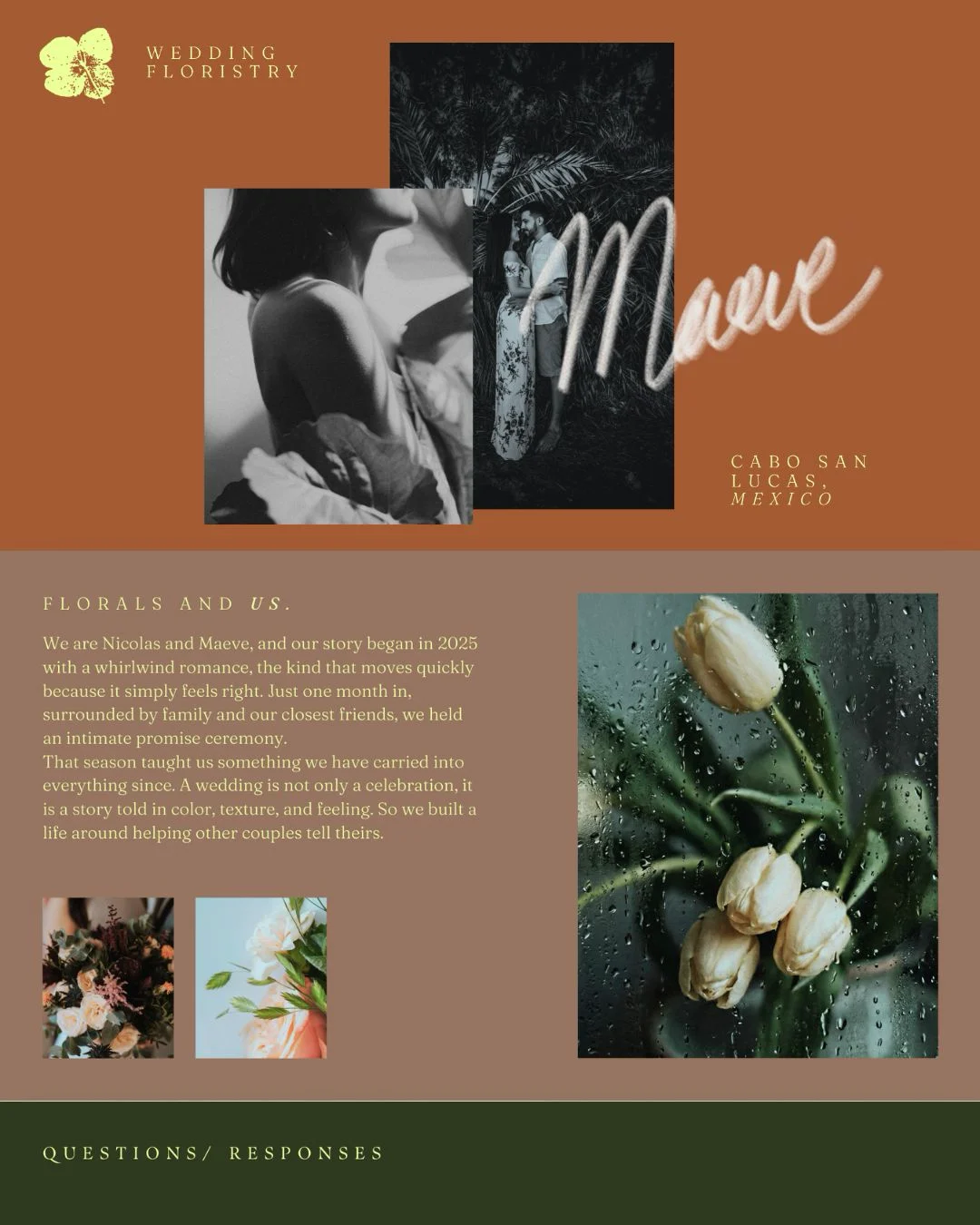
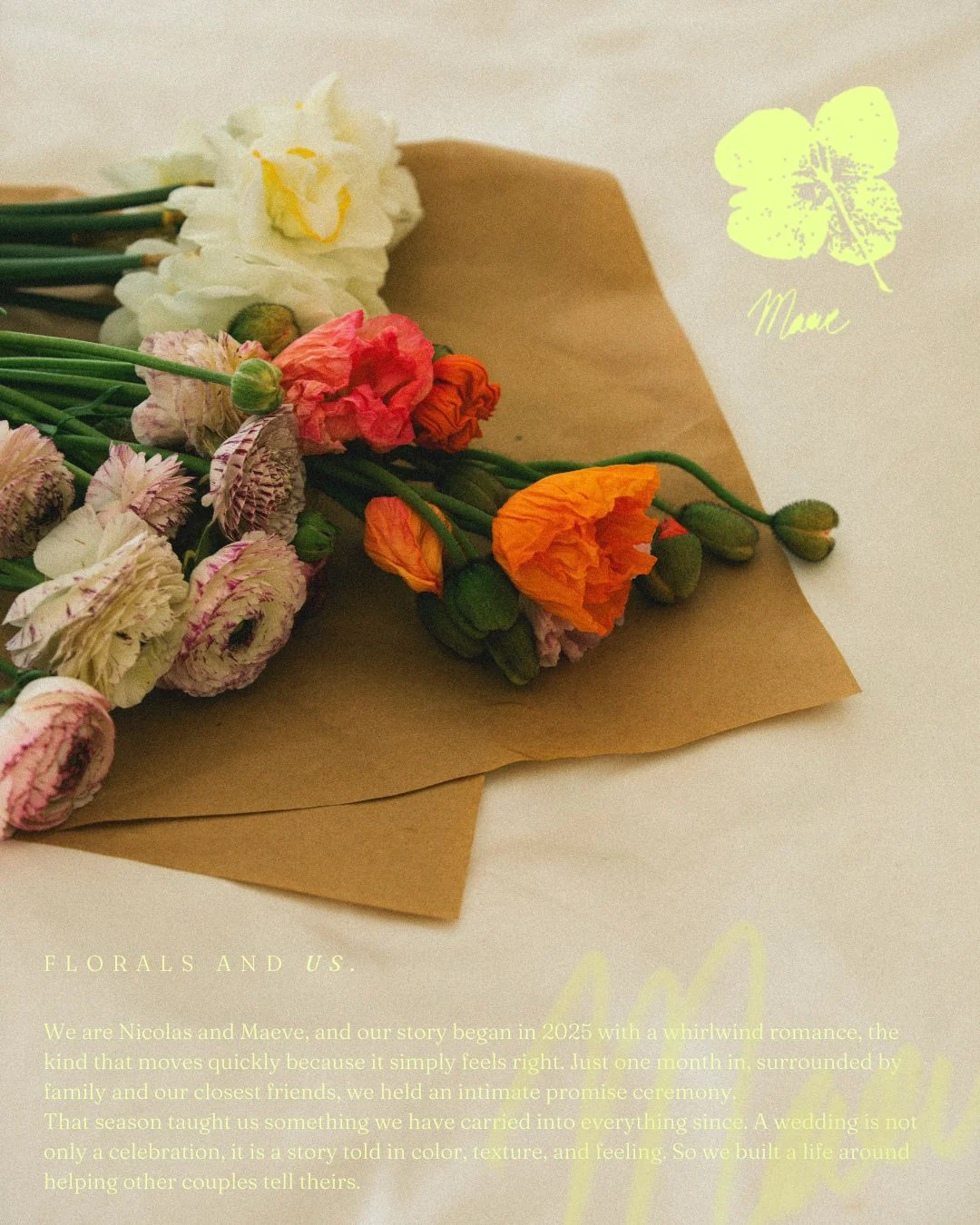
Wedding Florist Branding & Website Design — Maeve Floristry. Nicolas and Maeve build wedding florals the way they built their own story: quickly, intuitively, and with feeling over formula. They needed a brand that felt like them, not like every other florist on the feed.
Ink over polish. Story over showroom.
Wedding floristry has a default look: blush, white space, and a swirling script that could belong to anyone. Maeve Wedding Floristry, based in Cabo San Lucas, Mexico, deserved something with more grit and more romance. A brand that felt hand-touched, a little undone, and unmistakably theirs.
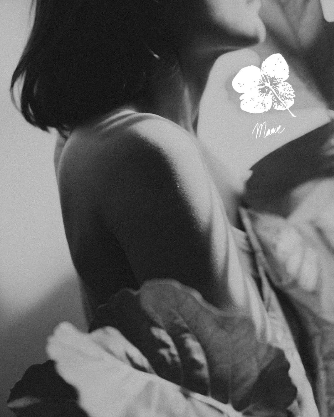
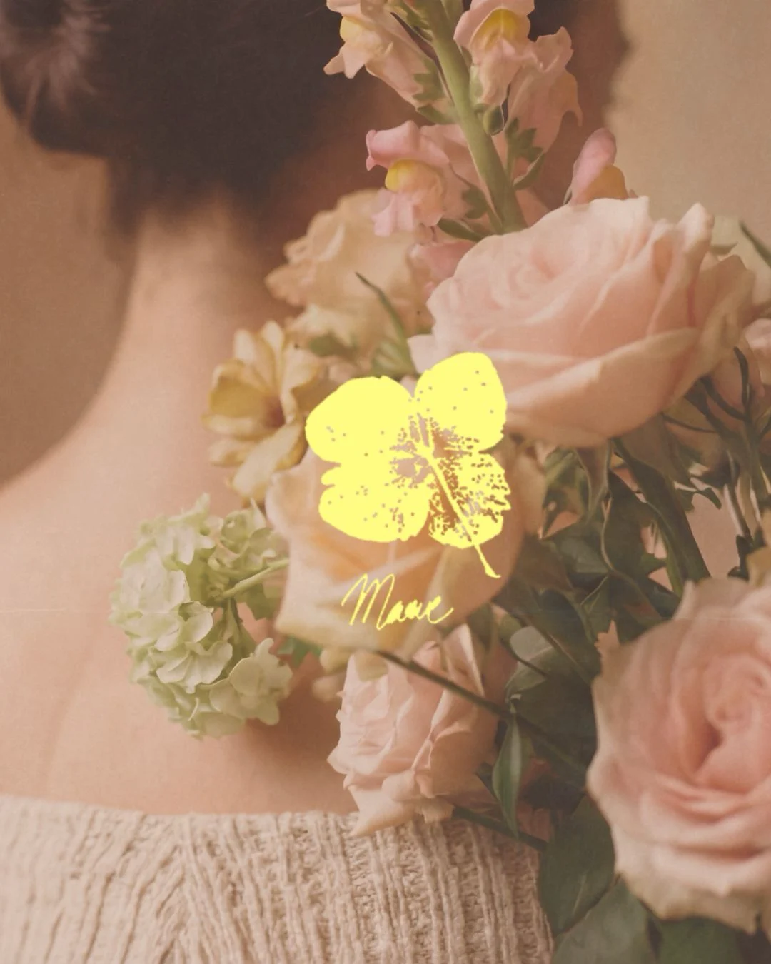
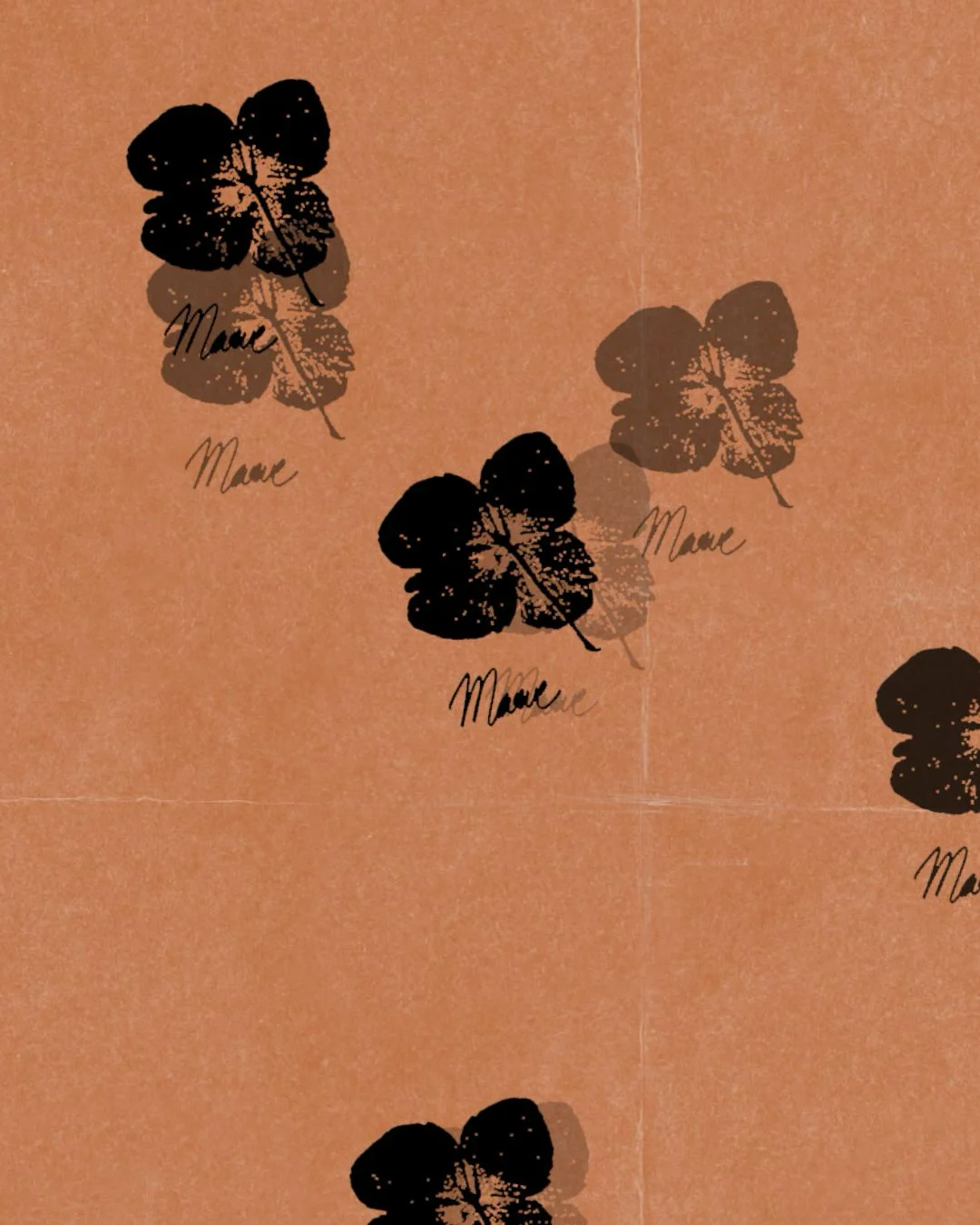
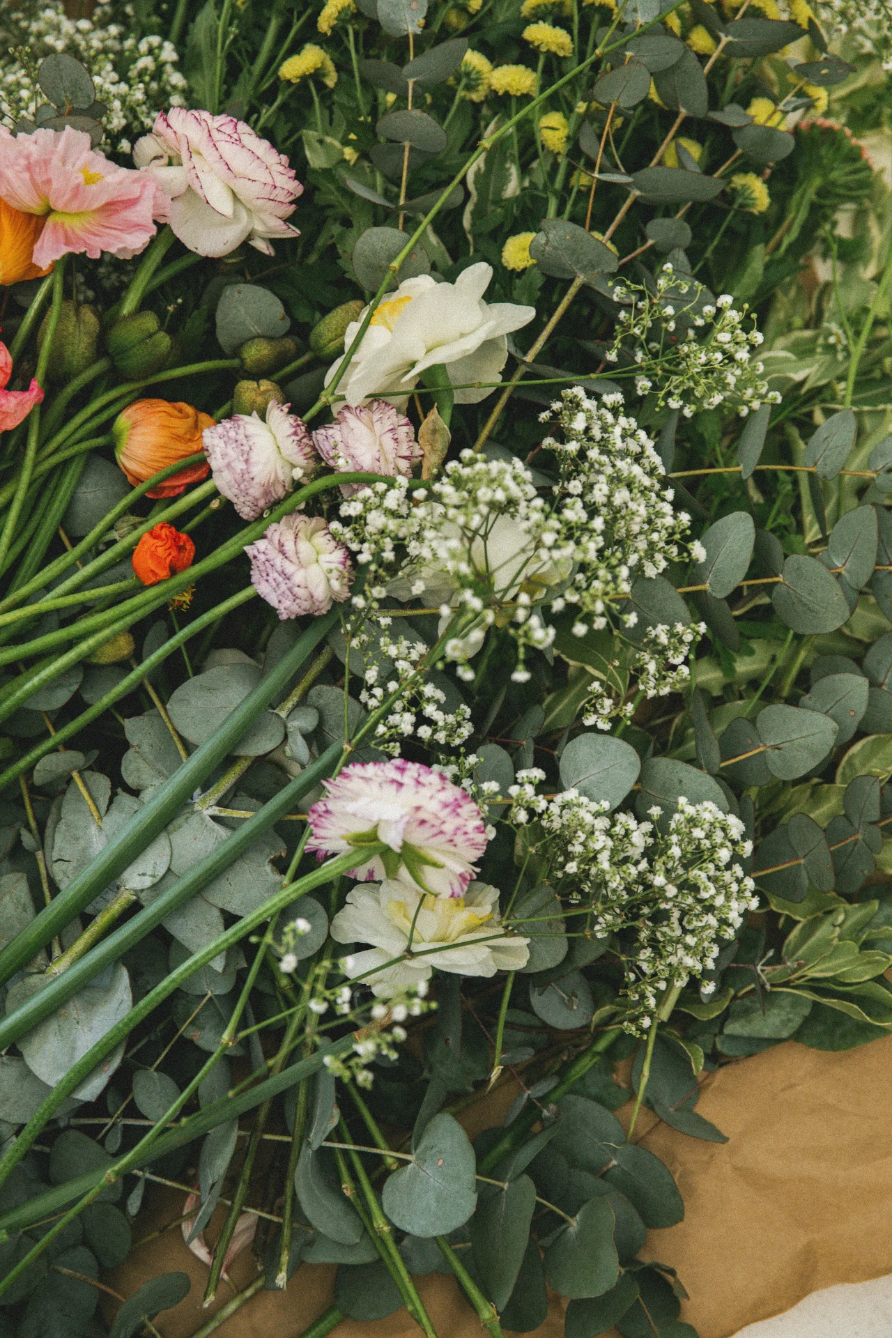
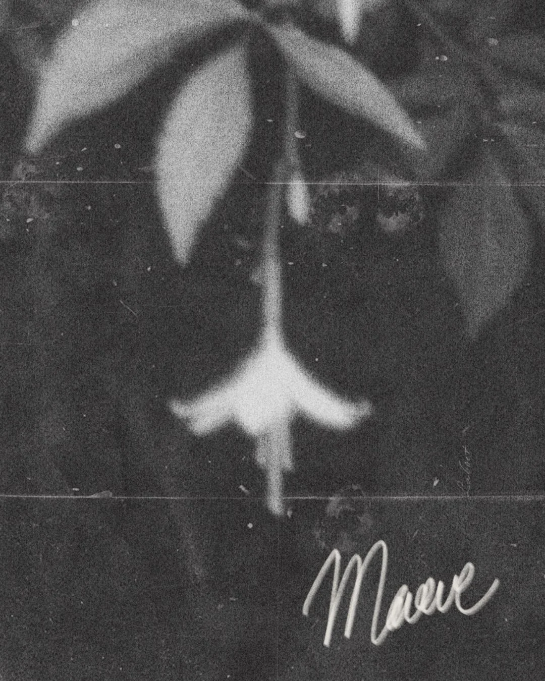
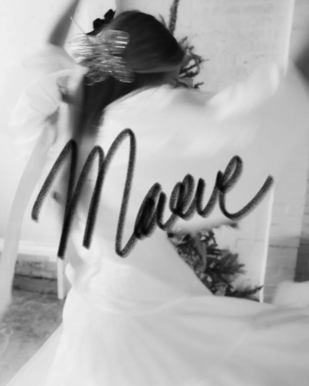
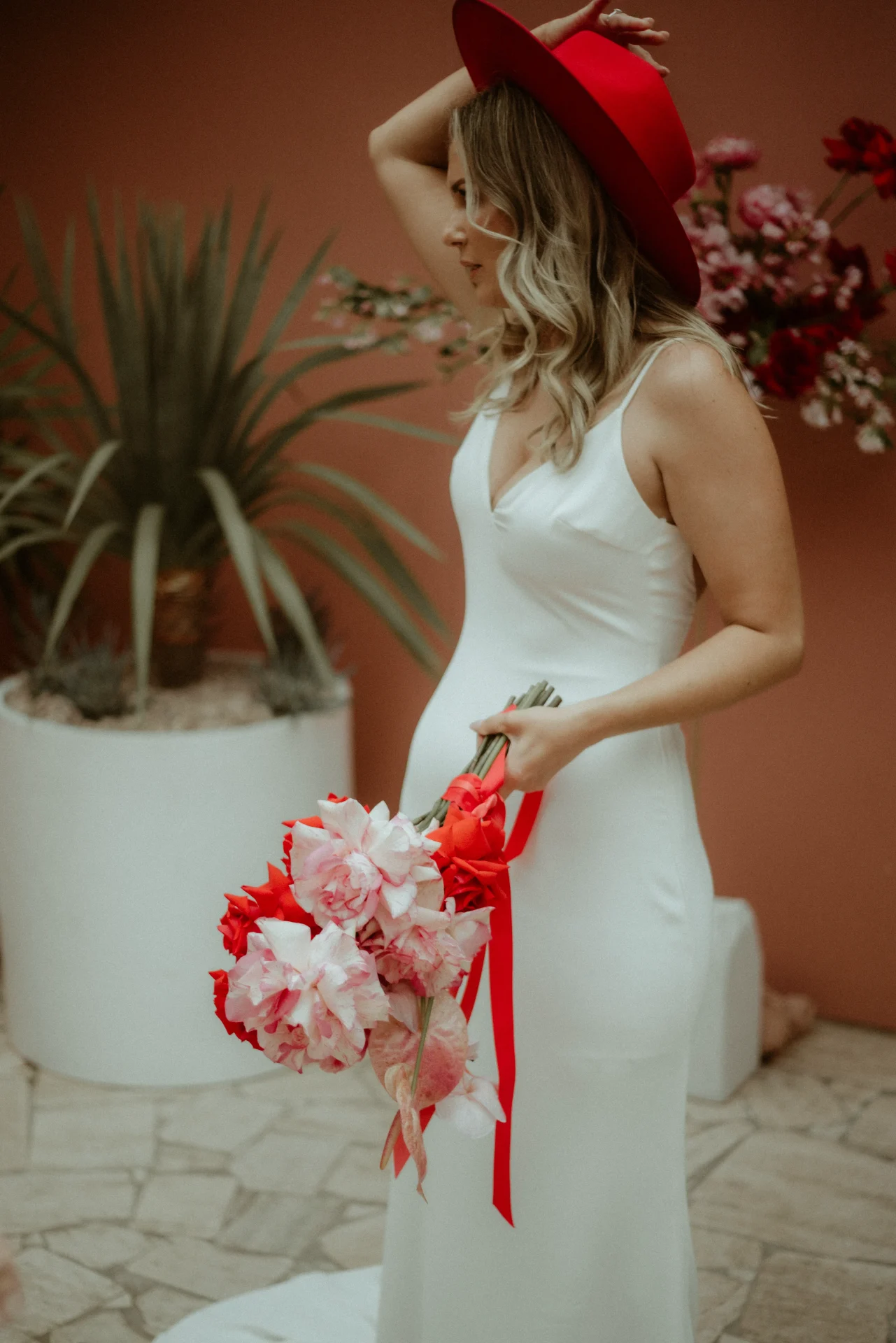
So we started with a real flower. We pressed it, inked it, and hand-stamped it, keeping every imperfection in the print. Alongside it we drew a custom handwritten “Maeve” wordmark that reads like a signature on a letter. Set against terracotta, olive, and a bright butter yellow, with grainy black and white photography carrying the emotion, the identity moves from a repeating pattern on tissue paper to a website that opens with their story before it ever mentions a price. It is a brand built for couples who want their flowers to mean something.