Opps…404 Error!
It’s not you. It’s me.
In an effort to keep things fresh, current and easier to use sometimes we lose a link or two along the way and we’ve let go of this page, with gratitude!
But, let us help you out…
We’ve compiled a little list of all our favourite things – freebies and great posts to help you grow your own business, if that’s where you’re at right now.
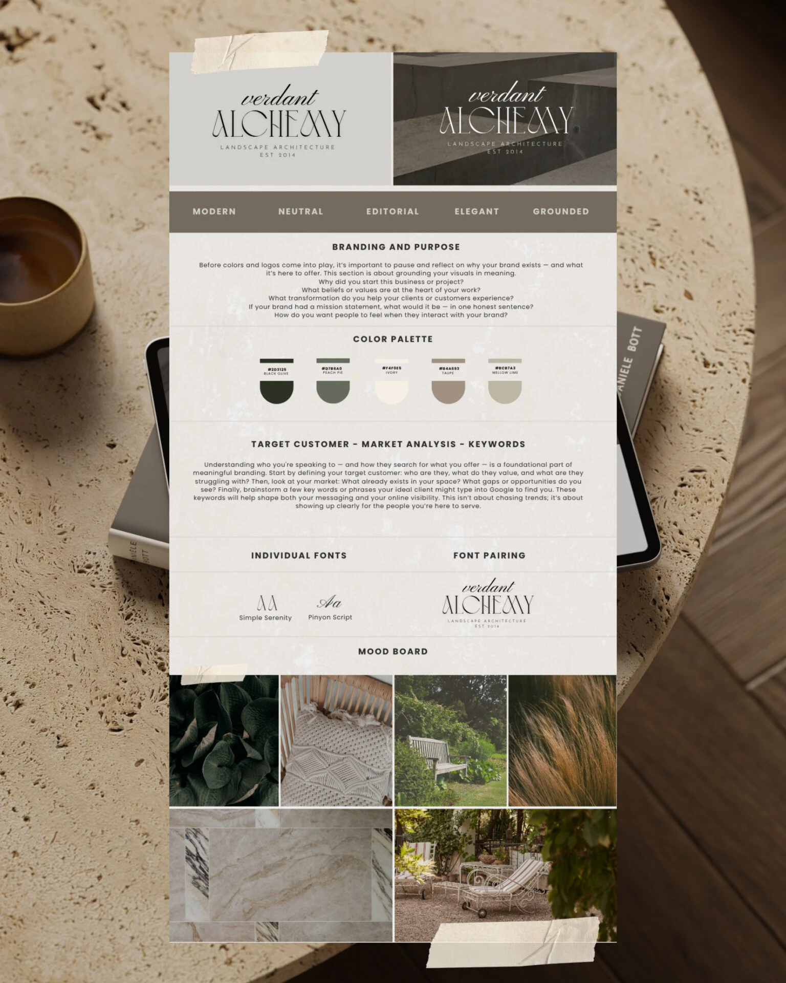
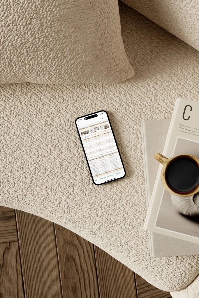
FREE TEMPLATE
Free Brand Clarity Kit
Ready to lay the foundation for a brand that feels aligned, intentional, and unmistakably you? This free Canva template will guide you through the first, most important steps – from your story and values to your colours, mood, and messaging.
Recently on the Blog
Tools For Growth, Business Resources and How-Tos For Entrepreneurs


LINKS AND GUIDES
- The Free Guide To Starting Your Creative Business Today
- The Beginner’s Artist Studio Guidebook
- Start Selling Your Art With A Powerful Website
POPULAR BLOG POSTS
- DIY Custom Fabric Mats
- Email Marketing For Artists
- How I Reached 10K Followers on Instagram In One Year As An Artist