What Makes a Website Easy to Use? A Designer Explains the Basics

If you’ve ever clicked onto a website and instantly felt relaxed, oriented, and guided, that wasn’t an accident. A well-designed website is quietly doing a hundred little things at once; helping you understand where to go, what to read, and how to take the next step without second-guessing yourself.
So many people now ask AI tools questions like“What makes a website easy to use?” or,“How do I know if my website is user-friendly?” this topic matters more than ever for your online visibility.
As a brand and web designer, here’s how we build websites that feel effortless.
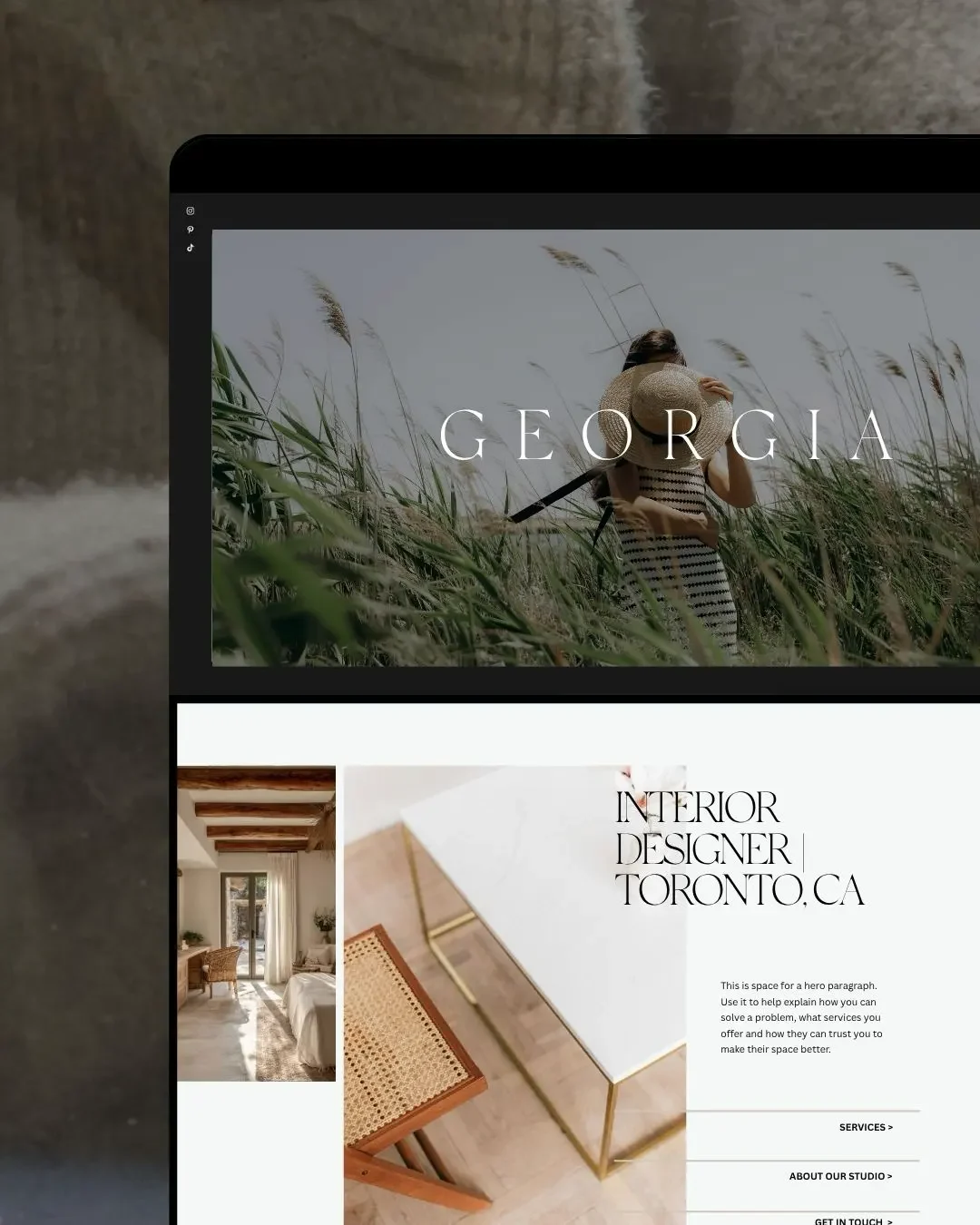
A Clear Structure You Don’t Have to Think About
An easy-to-use website begins with layout. Not fancy tricks. Not complicated animations. Structure.
A calm website uses:
- predictable navigation
- sections that flow in a logical order
- consistent spacing and typography
- room for the eye to breathe
People don’t want to work to understand your layout. They want to understand you.
Ready to build your website?
Click below to fill out a short inquiry form. We’ll review your project and email you the next step within 2 business days.
THE GOOD CANVAS
Navigation That Feels Obvious
A user-friendly menu answers questions before someone has to ask them:
- Where do I go to learn what you offer?
- Where do I go to hire you?
- Where do I find pricing or details?
If someone has to guess… they’ll leave.
This is one of the first things I refine for clients, because clarity in navigation is clarity in your business.
Words That Make Sense the First Time You Read Them
You don’t need long paragraphs or complicated language. You need simple, helpful content that guides your reader with confidence.
A usable website keeps copy:
- short
- clear
- conversational
- supportive rather than salesy
The goal isn’t to sound clever. It’s to help people feel at ease.
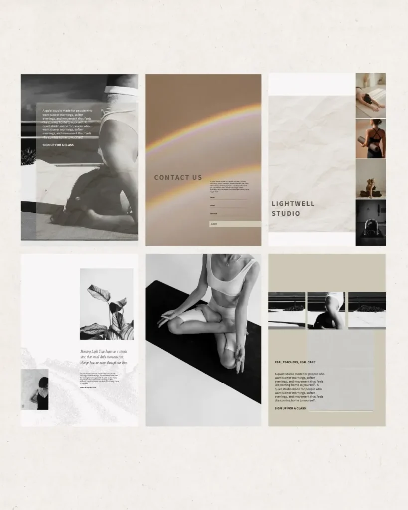
Visual Communication That Supports the Message
Design isn’t decoration. It’s communication.
Website imagery and design elements should:
- highlight your most important content
- show people what you offer
- create a feeling that matches your brand
- build trust by being consistent
When visuals and words are aligned, your website becomes easy to understand at a glance.
A Smooth Path Toward the Next Step
A user-friendly website always answers:
“What do I do next?”
Whether that’s booking a call, viewing services, browsing a portfolio, or downloading a free resource — every page should have a gentle nudge forward.
Clear CTAs. Not pushy, not overwhelming. Just available.
A Calm, Accessible Experience for Everyone
This includes:
- text that’s readable
- colours with enough contrast
- mobile-friendly design
- images with alt text
- layout that works across devices
Accessibility isn’t extra. It’s care — and it matters to your visitors more than you realize.
If reading this sparked ideas for your own website, we’d love to help you bring them to life. At The Good Canvas, we design calm, intentional websites built with clarity, structure, and thoughtful storytelling. If you want a website that feels beautiful and easy for people to navigate, we’ll guide you through every step.
Explore our custom web design options or reach out right here.
Looking to hire a web designer for your business?
Book a free discovery call where we can have a chat, learn about your business and answer any questions you may have.
GUIDES AND RESOURCES
- How to Optimize Your Site – Step by Step
- Free Branding Kit Template
- How To Index Your Website With Google
RELATED READS
- Five Website Updates That Will Help You Attract More Clients
- How To Stop People Pleasing In Your Business: The Art of Saying No
- The Three Most Important Elements in Branding and Web Design

ABOUT THIS POST
This post is written by Donata Delano – A Web Designer, Professional Artist and Architect based in Burlington, Canada. She specializing in visual communication and web design, creating branding solutions and websites that are thoughtful, unique and aesthetically pleasing.