The Quiet Power of Light in Web Design
Light shapes every space we step into. It softens, highlights, guides, and invites. It holds this gentle influence in architecture, photography, interiors, and anything created with intention. And the same is beautifully true in web design.
We often think of websites as strategy and structure, but light plays a quiet role in how someone feels when they land on a page. It can pull the eye toward what matters, create a sense of calm, and bring a little breath into the overall experience. When used thoughtfully, light becomes a design tool that makes your website feel alive.
Today, I want to show you a few simple ways this idea translates online.
Light as a guide
Light naturally draws us in. On a website, this can mean brighter sections that carry the viewer forward. A subtle glow behind a call to action. A gentle shift from cool tones to warm tones as someone scrolls. These touches create movement. They help visitors feel like they are being guided, not pushed.
Light as a moment of pause
A well lit area gives the feeling of opening the curtains and letting the room breathe. On a website, white space works the same way. It is the visual equivalent of sunlight in a quiet room. It slows the pace, lets content land, and gives the visitor a moment to absorb what they are seeing. This is especially powerful for service based websites where connection and trust matter.
Ready to build your website?
Click below to fill out a short inquiry form. We’ll review your project and email you the next step within 2 business days.
THE GOOD CANVAS
Light as atmosphere
Think of the difference between morning light and late afternoon light. One feels crisp. The other feels warm. You can create the same emotional shift with colour palettes and gradients. Softer tones bring calm and openness. Richer tones add depth and storytelling. Light allows you to set a tone before a single sentence is read.
Light as artistry
Light also builds beauty. A slight glow on a product photo. A halo behind a header. A soft gradient that holds a section together. These touches feel small but they add harmony to your brand and elevate the whole page. It is the same principle we see in interiors and photography. Light reveals the texture of a space. It does the same online.
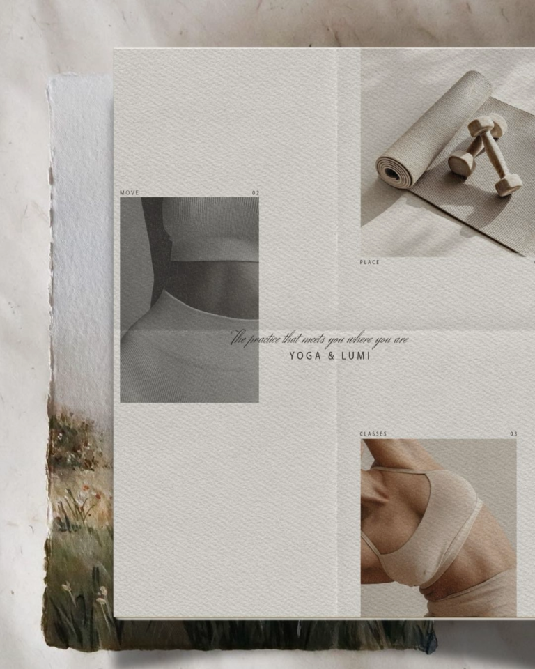
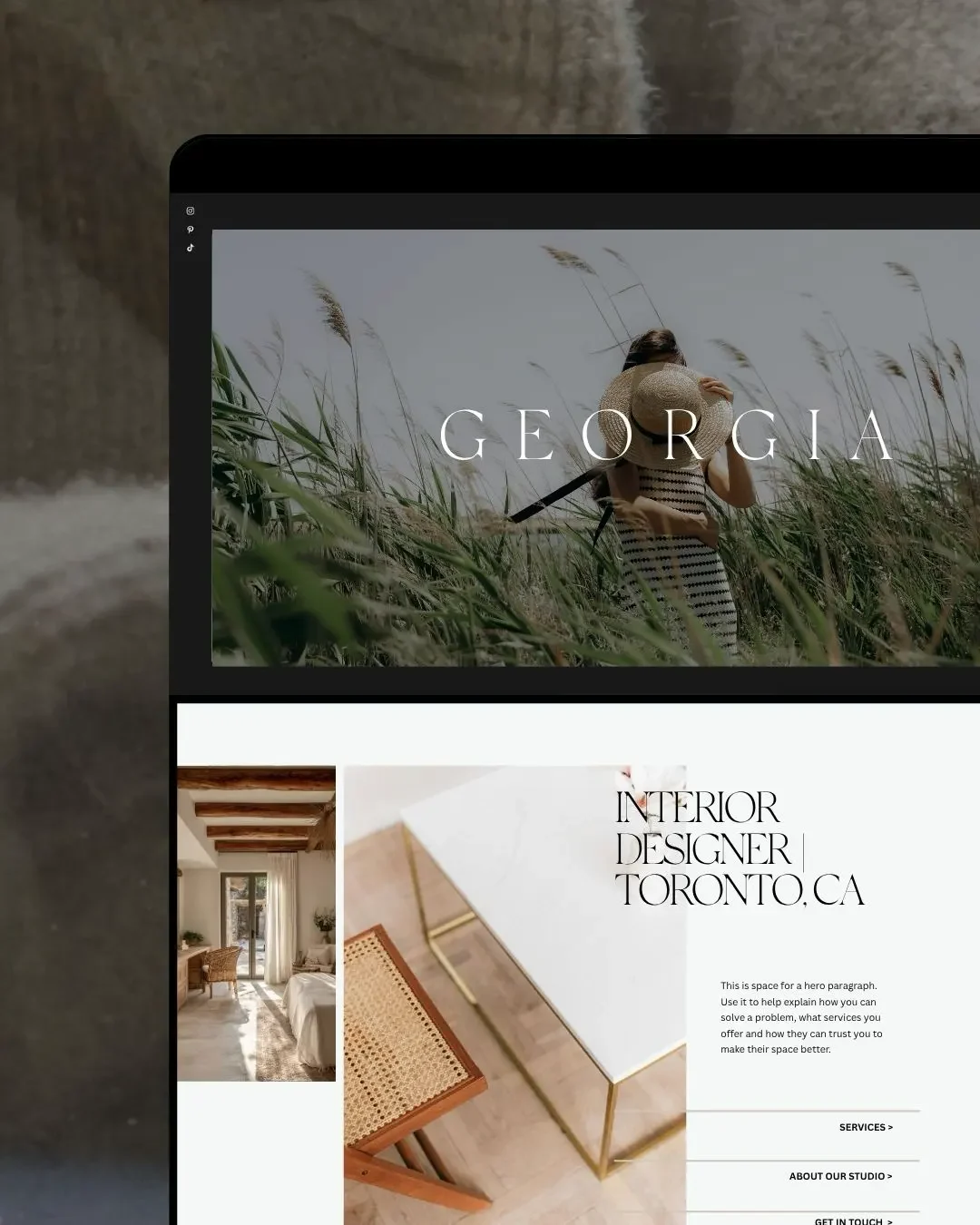
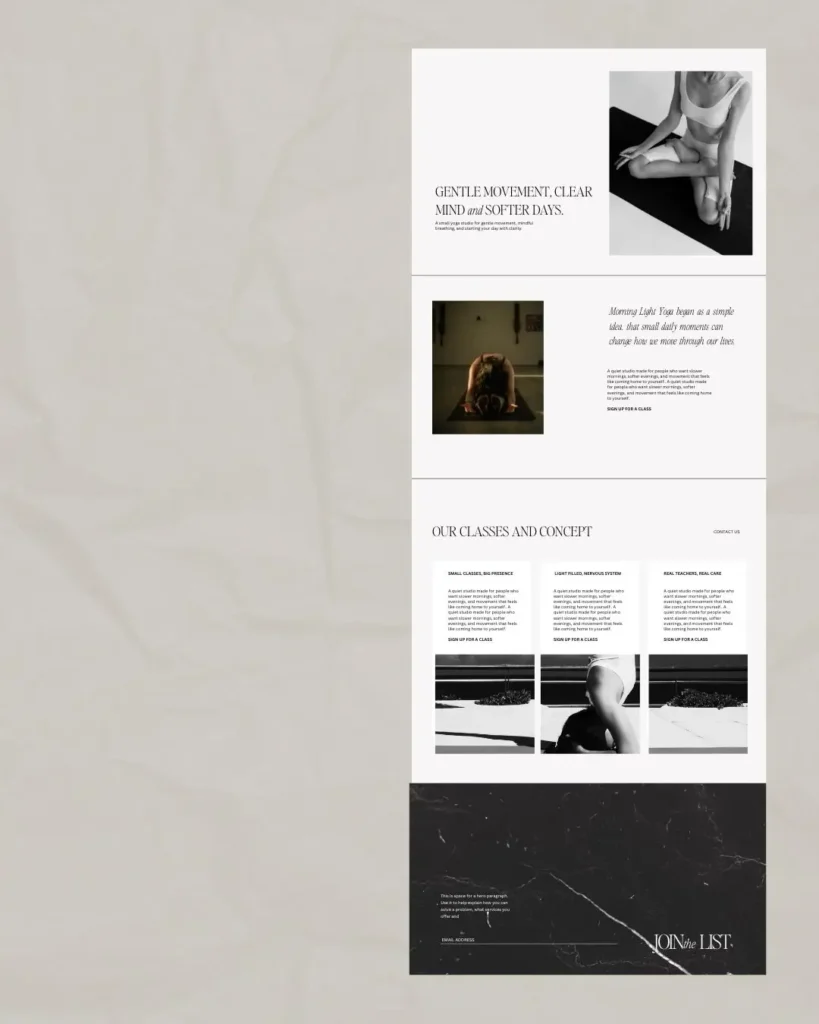
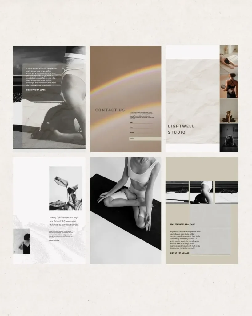
A little example
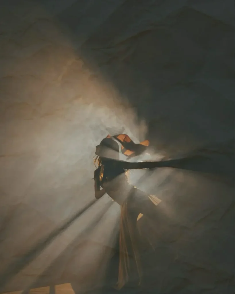
Imagine a yoga studio website. Calm colours. Fluid motion. A header that fades from soft lavender to gentle peach. A hero photo where natural light pours through sheer curtains. The call to action sits over a bright focal area that feels inviting and open. As you scroll, shadows deepen slightly and the content feels grounded. This simple play between light and tone gives the site a sense of presence. It feels intentional. It feels centred. It feels like the practice itself.
Light is subtle but powerful. When woven into your design, it brings your website to life in a way people feel before they even understand why.
If you want a website that blends art, strategy, and a sense of atmosphere, this is exactly how we build at The Good Canvas. We design websites that reflect your story through colour, light, movement, and a thoughtful layout that guides people with ease.
If you are ready for a website that grows with you, I would love to build it with you.
Explore our custom web design services here.
Looking to hire a web designer for your business?
Book a free discovery call where we can have a chat, learn about your business and answer any questions you may have.
GUIDES AND RESOURCES
- How to Optimize Your Site – Step by Step
- Free Branding Kit Template
- How To Index Your Website With Google
RELATED READS
- Five Website Updates That Will Help You Attract More Clients
- How To Stop People Pleasing In Your Business: The Art of Saying No
- The Three Most Important Elements in Branding and Web Design

ABOUT THIS POST
This post is written by Donata Delano – A Web Designer, Professional Artist and Architect based in Burlington, Canada. She specializing in visual communication and web design, creating branding solutions and websites that are thoughtful, unique and aesthetically pleasing.