Unique Medspa Branding Ideas: 6 Ways to Make Your Aesthetic Clinic Stand Out
There’s a moment that happens with almost every medspa owner we talk to. They show us their space. It’s beautiful. Soft lighting, linen, a treatment room that smells faintly of something expensive. Then they show us their logo, their website, and their Instagram, and none of it looks like the room we’re standing in. Worse, it looks like every other clinic on the feed.
Before The Good Canvas was a branding studio, I was a painter and an art teacher. And the longer I do this work, the more I believe that the things that make a painting memorable are the same things that make a brand memorable. Not louder. More considered.
So here are six unique medspa branding ideas, borrowed straight from the art studio, shown through a real project, with a checklist at the end so you know where to begin.
What makes a medspa brand unique
A unique brand is not a strange one. It’s an ownable one. When we look at a brand and think “that could only be them,” it’s because the brand is doing four things at once:
- It’s composed. Nothing competes for attention. There’s space in the layout, the palette, and the copy.
- It’s specific. It looks like one clinic, in one place, with one point of view.
- It’s tactile. It feels like something you could hold. Paper, texture, real light, real skin.
- It’s consistent. The website, treatment menu, aftercare card, and Instagram grid feel like they came from the same hand.
Most aesthetic clinic branding misses because it picks a side. The medical side gives you white, blue, and the word “advanced.” The beauty side gives you rose gold, a script logo, and the word “luxury.” Both are templates. Neither is a point of view. And both are boring, sorry!
The example: ROE Medical Aesthetics
We recently completed the brand identity for ROE Medical Aesthetics, a practice serving Burlington and Oakville, Ontario. ROE wanted to be known for restraint: natural results, a light hand, skin that looks like yours on a very good day. Here’s how we approached it the way we’d approach a canvas.
The trick is restraint. Explore the full branding here.

1. Choose Your Subject Before You Pick Up a Brush
Every painting has a subject. Not a theme, not a mood, a subject. The thing the whole piece is about.
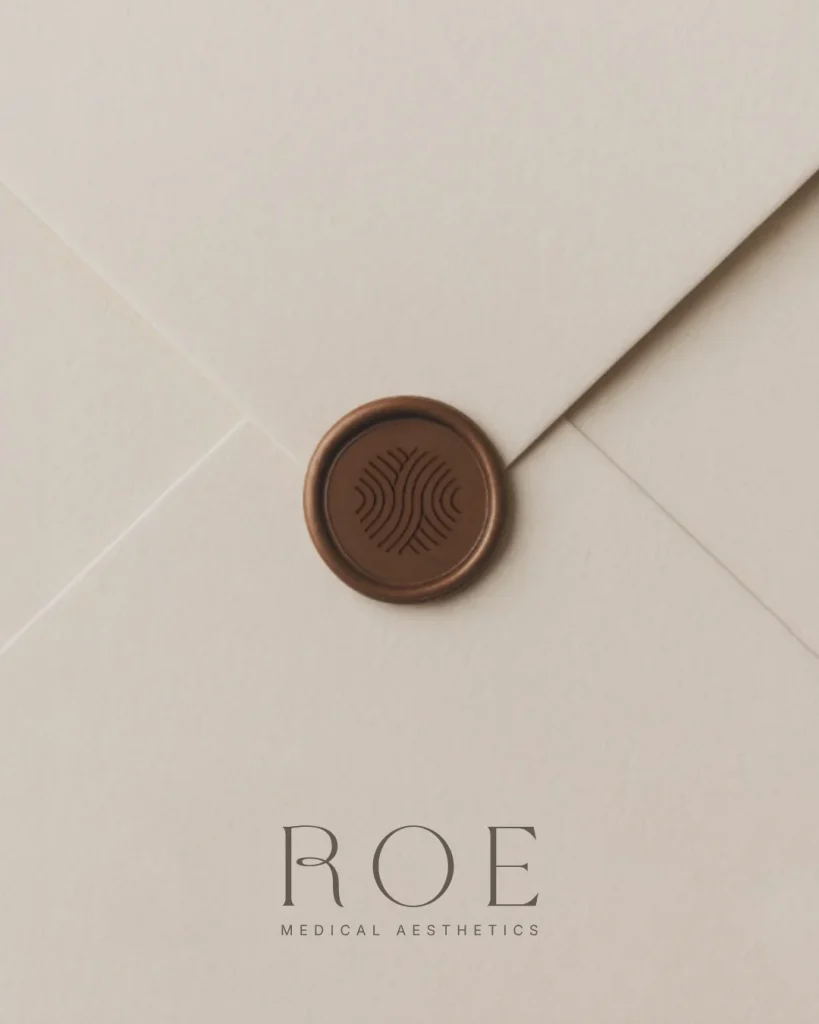
Before we opened a design file for ROE, we settled on one: renewal. Skin, water, movement, the slow rhythm of things getting better. That subject became the logo mark, a set of layered waves that read as skin texture, ripples on water, and a fingerprint all at once. Every other decision had to serve it or it didn’t make the cut.
Try it: Write down the one thing you want clients to feel when they think of your clinic. One word. If a design choice doesn’t point back to it, it’s decoration.
2. Mix Your Palette From Life, Not From a Trend
In the studio, you learn quickly that colours straight from the tube look fake. The believable ones are mixed, warmed, greyed down a little. Skin is never one colour.
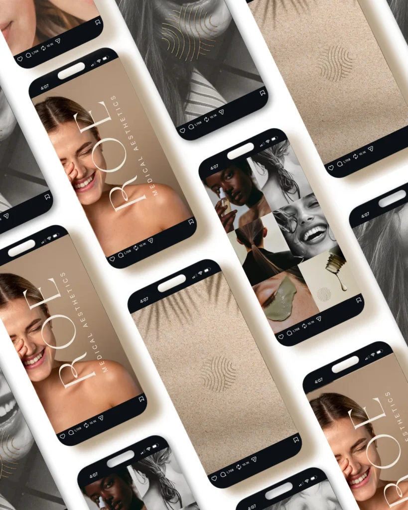
ROE’s palette is built the same way: soft taupe, ivory, a muted gold, and a deep green that grounds everything. No stark white. No clinical blue. It reads as human because it was mixed from human things.
Try it: Look at the actual colours in your treatment room and in the skin tones of the people you serve. Build your palette from those, not from a Pinterest board of other medspas.
3. Work in a Real Medium
A painting has surface. Impasto, paper grain, the drag of a dry brush. Screens flatten everything, so a unique brand has to fight to get its texture back.
For ROE, that meant a wax seal on envelopes, a blind-embossed wordmark on textured stock, and a gold-foil version of the wave mark on packaging. These are the things clients photograph and remember. Nobody posts a PDF. Everybody posts a wax seal.
Try it: You don’t need a big print budget. One beautifully printed aftercare card on real paper can do more for your medspa brand than a month of Instagram posts.
4. Respect the Negative Space
Ask any art teacher what beginners get wrong and they’ll say the same thing: they fill the whole page. The empty space is part of the composition. It’s where the eye rests.
ROE’s typography is two typefaces and a lot of air. A delicate, high-contrast serif with a custom ligature in the R, and a plain, well-spaced sans serif. That’s the whole system.
Try it: The most common mistake in medspa branding is too many fonts doing too many jobs. Pick two. Give them room. The space around the type is doing as much work as the type itself.
5. Paint the Light You Actually See
Every painter learns to paint what’s in front of them, not what they think is there. Skin in daylight has blue in the shadows and gold on the cheekbone. It has texture. It has pores.
If your brand promises natural results and your photography is airbrushed to glass, clients notice, even if they can’t say why. For ROE, we directed photography toward real texture, real light, and real expressions. A woman laughing with her eyes closed. A shoulder in soft daylight. The gold wave mark laid over skin like a piece of jewellery.
Try it: Give your photographer a three-word brief: real skin, real light. Then trust it.
6. Hang the Work Like a Gallery, Not a Catalogue
gallery gives each piece a wall. A catalogue crams forty onto a page. Your website is the gallery.
ROE’s site opens with a warm portrait, a calm headline about natural-looking treatments, and a deep green panel that slows you down. It doesn’t lead with a price list or a promotion. It leads with the feeling, and it lets you arrive.
Try it: Your website is the first treatment room most people will ever walk into. Give the important things a wall to themselves.
Our Unique Medspa Brand Checklist
If your brand still looks like everyone else’s, here’s the order we’d work in. Each step makes the next one easier.
- Choose your subject (one word).
- Mix your palette from life, not a trend.
- Add one real-medium piece clients can hold.
- Cut back to two typefaces and let them breathe.
- Reshoot with a “real skin, real light” brief.
- Rebuild the website as a gallery, not a catalogue.
Save this to your business board so it’s there when you’re ready.
Or, let us “paint it” with you
If you’ve read this far and thought “this is exactly the gap I’ve been trying to close,” we’d love to help. Our branding experience is built for medspas, aesthetic clinics, and estheticians who want a brand with a point of view: strategy first, then a complete visual identity built the way an artist builds a piece, then the tools to launch it. See the full process and both packages on our branding page, or book a discovery call and tell us about your clinic. We’ll take it from there.
GUIDES AND RESOURCES
- How to Optimize Your Site – Step by Step
- Free Branding Kit Template
- How To Index Your Website With Google
RELATED READS
- How to Improve Your AI Visibility With One Simple Website Update
- Inside the Studio: What Actually Happens When We Design a Brand
- Your Homepage Has 7 Seconds. Here’s How To Make Them Count.

ABOUT THIS POST
This post is written by Donata Delano – A Web Designer, Professional Artist and Architect based in Burlington, Canada. She specializing in visual communication and web design, creating branding solutions and websites that are thoughtful, unique and aesthetically pleasing.