How to Create a Cohesive Colour Theme for Your Website (So It Feels Like You!)
You know that feeling when you walk into a beautifully designed space, and everything just fits? The colours, the textures, the mood—it all feels intentional and effortless.
That’s exactly how your website should feel.
Your website’s colour theme is more than just an aesthetic choice—it sets the tone for your brand, makes your content more readable, and creates an experience that feels just right for your audience.
But how do you actually choose the right colours—and make sure they work together? Here are our tips!

1. Start with Your Brand’s Core Identity
Before you pick colours, take a step back and ask yourself:
- What feeling do I want my brand to create?
- What words describe my brand’s personality? (Bold? Soft? Artistic? Minimal?)
- How do I want people to feel when they land on my site?
Your colours should visually represent the essence of your brand. For example:
- A soft, romantic brand might use muted pinks, creams, and warm neutrals.
- A bold, modern brand might lean into deep blues, rich blacks, and sharp contrasts.
- A playful, creative brand might embrace bright, vibrant pops of colour.
Your website’s colours should feel like home—a reflection of who you are and what you stand for.
Tip: If you already have a logo, use it as a starting point! Your website colours should complement (not compete with) your branding.
2. Pick a Primary Brand Colour
Your primary brand colour is the main colour that represents your business. It’s the colour people will associate with you—think of Tiffany’s blue or Target’s red.
- Use this colour for key areas of your website, like buttons, headlines, or your logo.
- Make sure it aligns with the mood you want to create.
- Keep it consistent across all your branding—your website, social media, and marketing materials.
If you already have a strong brand colour, great! If not, start by choosing one that feels right for your business.
3. Choose Supporting Colours (But Keep It Simple!)
Once you have your primary colour, you’ll need a few supporting colours to balance things out.
A good rule of thumb: Stick to 3–5 colours total. Any more, and things start feeling chaotic instead of cohesive.
- A neutral colour (white, beige, grey) for backgrounds and text.
- An accent colour to add contrast and visual interest.
- A secondary colour that complements your primary brand colour.
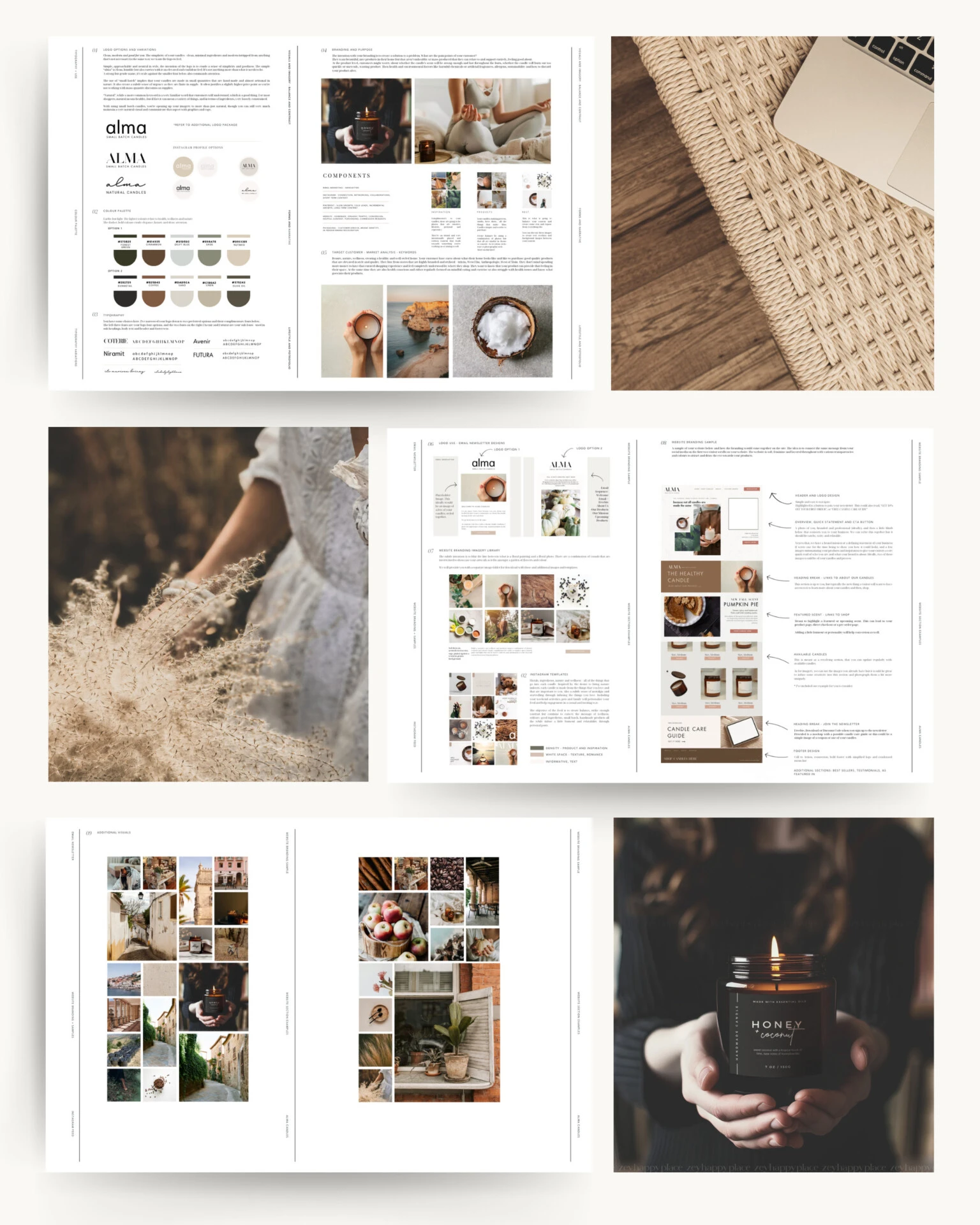
For example, if your primary colour is a deep forest green, your supporting colours might be warm taupe (neutral), a soft gold (accent), and a muted sage green (secondary).
Our Little Tip: Not sure what colours work well together? Use a colour palette generator like Coolors or Adobe Colour to explore combinations!
4. Keep Your Colours Consistent Across Your Website
A cohesive colour theme isn’t just about choosing the right colours—it’s about using them consistently.
- Avoid using random colours just because they “look nice.”
- Don’t mix too many different shades of the same colour—it can feel messy.
- Use your brand colours intentionally for buttons, links, backgrounds, and text.
Your website should feel seamless from page to page, creating a unified, professional look.
Create a brand style guide with your exact colour codes (HEX, RGB, CMYK) so you can stay consistent across all platforms. Or, you can hire us to create a complete branding kit for you!
5. Make Sure Your Colours Are Readable (And Accessible!)
It’s easy to get caught up in picking pretty colours, but if your website isn’t readable, visitors won’t stick around.
- Dark text on a light background is the most readable option. Classic is often the best!
- Avoid super light or neon colours for text—they can be hard on the eyes.
- Make buttons stand out by using your primary brand colour (but make sure the text is legible!).
Your website should be as easy to use as it is beautiful. A great colour scheme enhances the experience—it never gets in the way.
Need Some Help? Let’s Make Your Branding A Dream!
A cohesive colour theme is one of the easiest ways to make your website feel polished, professional, and uniquely you.
When your website’s colours work together, everything feels more intentional—and your brand instantly becomes more memorable.
And if you’re feeling stuck on colour choices or want expert guidance, we’re here to help. ??
Feel free to visit our FAQ section or set up a free discovery call when you can ask all the questions you’d like!
Join The Good Canvas
Looking to hire a web designer for your business?
Book a free discovery call where we can have a chat, learn about your business and answer any questions you may have.
GUIDES AND RESOURCES
- How to Optimize Your Site – Step by Step
- Free Branding Kit Template
- How To Index Your Website With Google


