The Editorial Website: What a Service Business Can Borrow From Magazines (remember those?)
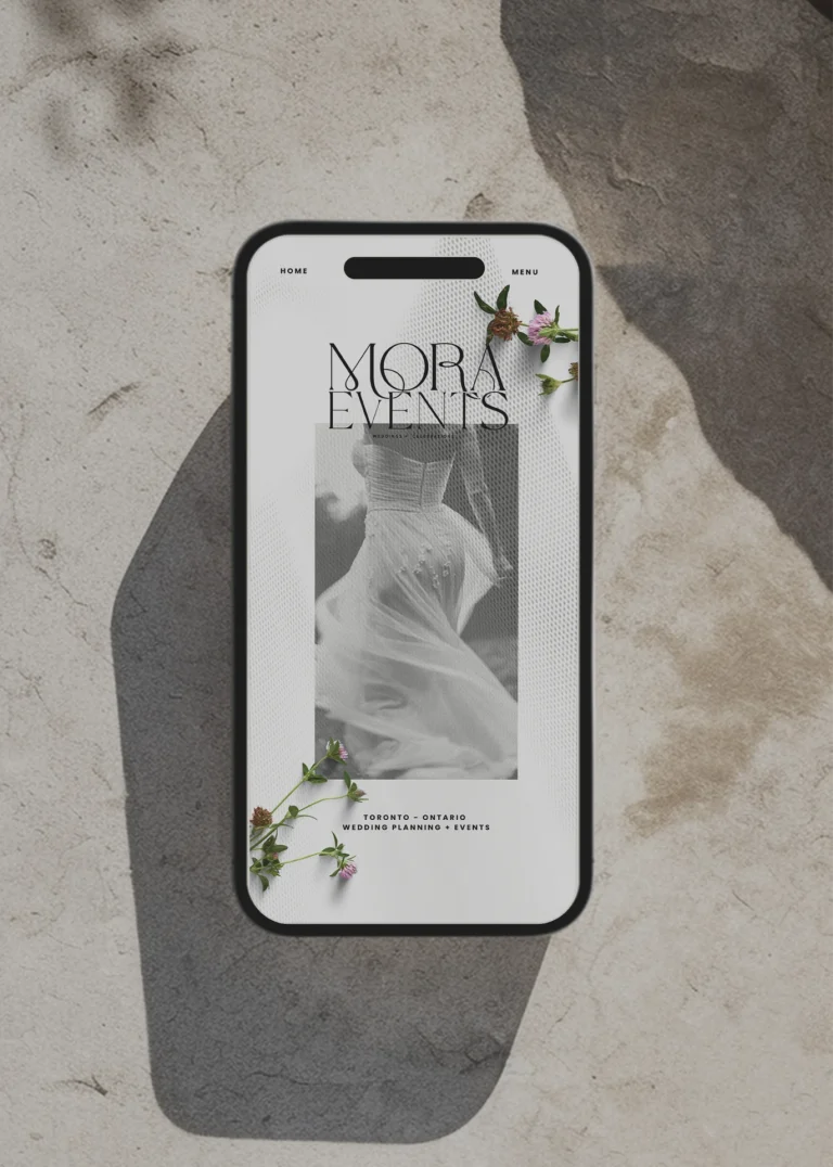
There’s a wedding publication I keep going back to, not because I’m planning a wedding but because of how it makes me feel in the first second. Nothing on the page is asking me to do anything. That’s so evident for me and I love it. There’s a photograph, a line of serif type with one phrase in italics, a small label above it in capitals, and a great deal of white. It reads like the opening spread of a magazine, and I notice that I slow down, the way you do when you turn a page rather than scroll one.
Most service business websites do the opposite. They speed you up. Three columns of icons, a headline with a verb in it, a button, another button, a strip of logos, a popup. Everything is urgent and nothing is composed. The owner has usually been told that this is what a website is supposed to look like, and the template agreed.
I’ve come to think the most useful thing a small business can do for its website is to stop looking at other small business websites and start looking at magazines. Not for the content, but for the posture.
What a magazine assumes about you
It’s so simple. A magazine assumes you have time. The luxury, right? That’s its fundamental courtesy. It gives you one thing at a time, in an order, with room around each thing, and trusts that if the first spread is beautiful enough you’ll turn to the second. It doesn’t put the subscription card on the cover.
That assumption changes everything downstream. The type can be larger and quieter. The photographs can be fewer and better. The headlines can say something instead of selling something. And the reader, who is in your case a prospective client, arrives at the end of the page having had an experience rather than having been processed.
For a service business this matters more than for almost anyone, because you’re not selling an object the visitor can evaluate. You’re selling what it will be like to work with you. A site that rushes her tells her you will rush her. A site that gives her room tells her you’ll give her room. The design is the first deliverable, and she’s reading it.
The devices, and what each one is for
Editorial design has a small vocabulary and it’s worth learning the words.
The eyebrow. That small line of capitals above a headline: Recent Work. From the Journal. The Studio. It does the job of a section heading without the weight of one, so the headline underneath can be a sentence rather than a label. On a service site, an eyebrow lets your Services section be introduced by “What We Do” in small caps and then say something true in large serif beneath it, instead of the heading having to do both jobs and doing neither well.
The italic accent. One phrase inside a headline set in italics. The Art of the Quiet Brand. Spaces that feel like you. It’s the typographic equivalent of a change in the speaker’s voice, and used once per headline it gives a whole site a personality without a single decorative element. Used three times per headline it becomes wallpaper, so the discipline is the point.
The narrative title. A magazine never captions a photograph “Project 4.” It writes “A Wellness Brand That Learned to Speak Softly” and puts the city underneath. Your portfolio is the place this matters most. Each project you’ve done has a story in it, usually one sentence long, and that sentence is a better title than the client’s name. The client’s name goes in the caption, where it belongs.
The generous grid. Magazines put six photographs on a spread, not sixty, and each one has air. On a website this means fewer, larger images with consistent spacing and a rhythm that repeats. The feeling of abundance comes from the quality of what’s shown and the confidence of the space around it, not from the count.
The single column of text. When a magazine wants you to read, it gives you one column at a comfortable width and gets out of the way. Three-column feature grids with icons are the opposite of reading; they’re skimming furniture. If you have something to say about how you work, say it in one column, in paragraphs, with a photograph beside it.
And white. Or in your case, perhaps, oatmeal or linen or whatever your brand’s quiet ground is. The space between things is the most expensive-looking element on any page and it costs nothing. The reason most small business sites feel cheap is that there’s no room in them. The reason the publication I keep returning to feels like a magazine is that most of every page is empty.
What this looks like on a service site
Imagine a naturopath’s site built this way. The top of the page is one photograph of her treatment room with the morning light in it. Below, an eyebrow that says Burlington, Ontario, and a headline in serif: Care that moves at the pace of the body. One line beneath it, one button.
Then an eyebrow, Start Here, and three images with narrative titles: The First Visit, Ongoing Care, For the Whole Family, each with a line of text that describes a person rather than a service.
Then From the Practice, three recent posts, titles only.
Then a single column, with her photograph on one side and four paragraphs about how she works on the other.
Then a quiet band inviting you to the newsletter, and a footer.
Nothing in that layout is unusual. What’s unusual is that each thing has been given room, named in a human sentence, and put in an order, and the visitor has been trusted to follow. That’s the whole technique.
A word about platforms
I’ll say this once because it’s practical. This kind of site is easier to build on a platform that wants to make it. Squarespace, for whatever its limits, was built by people who thought in magazine terms: strong grids, generous defaults, type that’s treated as design rather than as content. The editorial posture is nearly the path of least resistance there, which is one of the reasons we moved. On more open platforms you can get there, but you’re often fighting a template that wants to put icons in three columns.
The discipline underneath
The hard part of an editorial website isn’t the design. It’s the restraint required to keep it. Every month something will ask to be added. A badge, a banner, a second button, a popup someone swears converts. Each one is a small withdrawal from the account of calm you built, and the account empties faster than it fills.
So the last thing I’d borrow from magazines is their editor. Someone whose job is to say no, to cut the second headline, to leave the spread alone. For a small business, that’s usually you, a few months after launch, looking at the site as the reader rather than the owner, and taking something away.
I keep going back to that publication because every time I do, it’s still quiet. Someone there is holding the line. That’s what makes it feel expensive, and that’s what you can have, on whatever budget, if you’re willing to hold yours.
If you’d like a website that reads like the opening spread rather than the subscription card, tell us about your business. We’ll build it with room in it.
GUIDES AND RESOURCES
- How to Optimize Your Site – Step by Step
- Free Branding Kit Template
- How To Index Your Website With Google
RELATED READS
- How to Improve Your AI Visibility With One Simple Website Update
- Inside the Studio: What Actually Happens When We Design a Brand
- Your Homepage Has 7 Seconds. Here’s How To Make Them Count.

ABOUT THIS POST
This post is written by Donata Delano – A Web Designer, Professional Artist and Architect based in Burlington, Canada. She specializing in visual communication and web design, creating branding solutions and websites that are thoughtful, unique and aesthetically pleasing.